For a brand or company logos are more important than ever… As Rachel Zoe said, “Style is a way to say who you are without having to speak.” These outstanding logo design trends in 2025 will give you better ideas for new or old company logos… Let’s Dig into it!!
Logo design involves much use of creativity, and when it comes to creativity, change is inevitable.
Logo design trends are constantly evolving, with new styles emerging rapidly and many older designs returning with a fresh, modern twist.
Since the ideas are limited, we have also seen several new trends inspired by the existing and even old logo designs – which isn’t a bad thing at all. All we need is one perfect web design with a fascinating logo.
Top Logo Design Trends to Watch in 2025
Let’s take a look at current logo design trends for 2025. See if you can find your favourite design among these.
#1. Shadow Breaks:
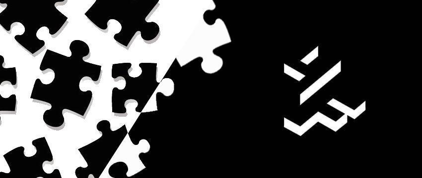
Lately, we have seen many designs with lines (stripes) closely passing over one another without actually touching or merging, and the gap between them is neatly filled with an abrupt shadow.
The logo of ‘FH’ Monomark shown in the image is one example of this.
#2. Broken Letters

They look beautiful and exciting at the same time. Take the example of the ‘Fuzzie’ brand logo below.
It is a gifting app by Bravo. The letters, as well as the image of the teddy bear, are broken, and the logo looks amazing. Well, Fuzzie isn’t the only company using a broken letterforms logo.
Many startups and businesses including Openly, BDO, Scala, etc. feature broken letters in their brand logos. We think it is going to make the latest logo design trends in 2025.
#3. Minimalist design:
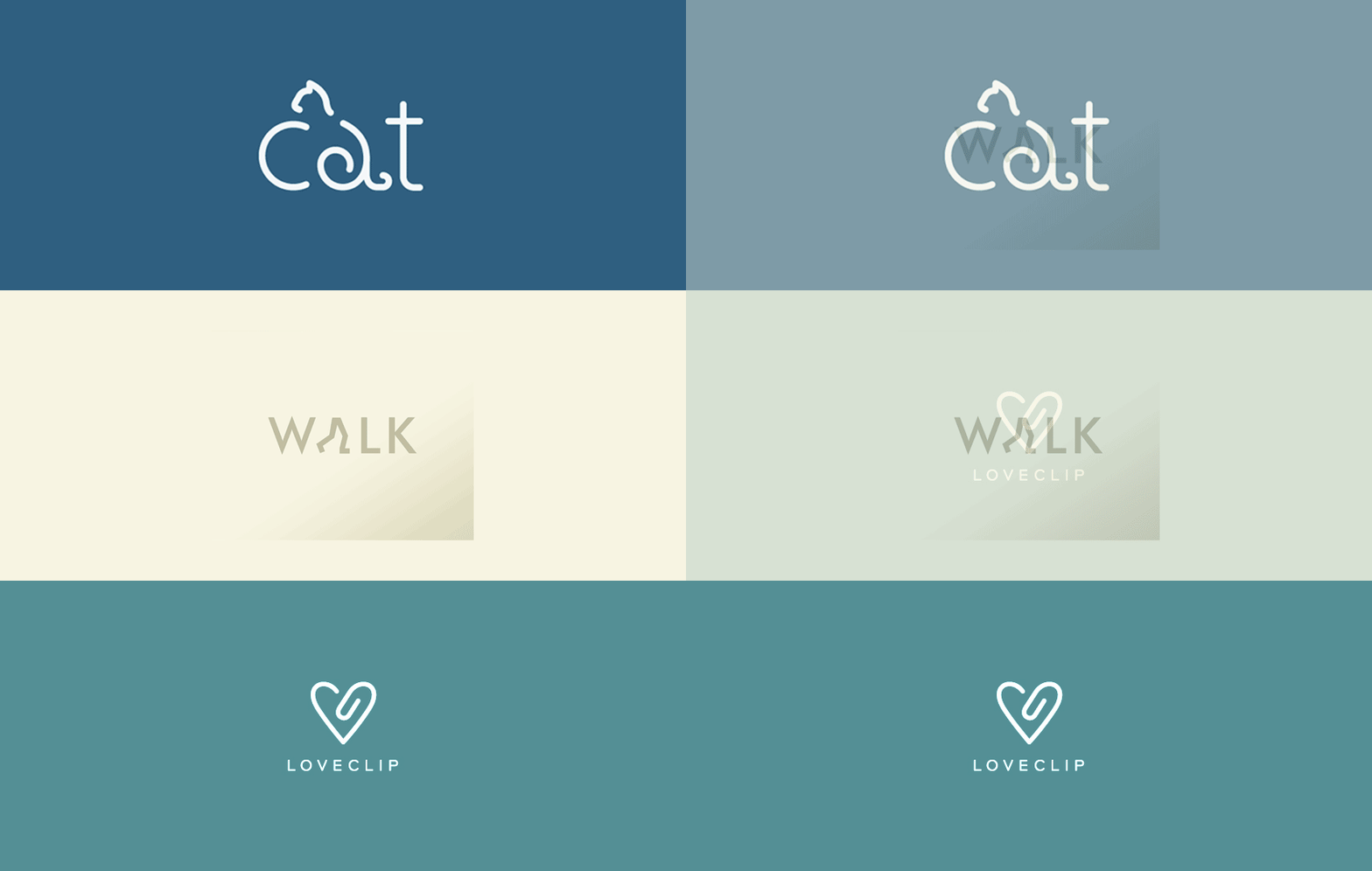
Many brands prefer simple and minimalist logo designs over complex and visually rich logos.
This is to realize the actual purpose of a logo which is to tell your customers what your company actually does. The meaning and ideation of the brand are reflected in the logo itself.
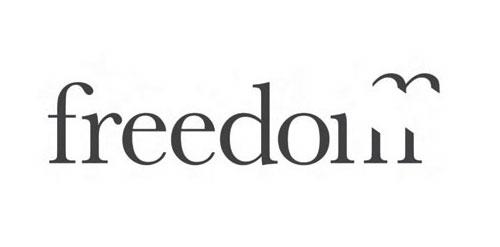
See above the logo image. It contains a single word ‘freedom’ with a section of ‘m’ removed in the shape of a bird that actually explains the meaning of freedom.
Top Web Design Trends That can Mesmerize Anyone
#4. Colour Shades:
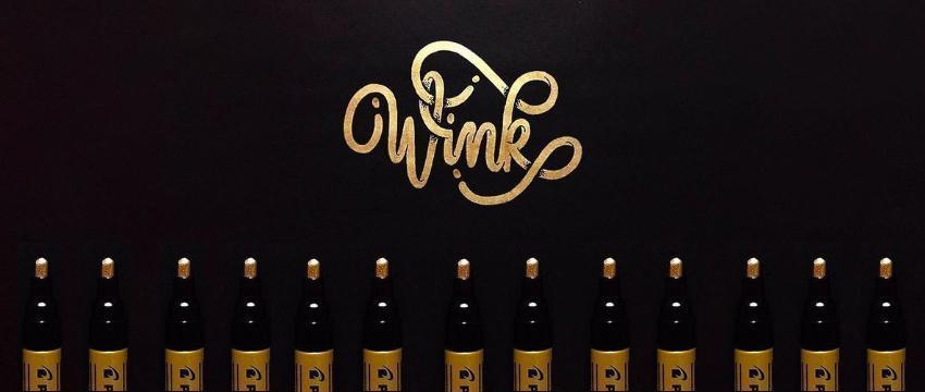
Shades have always been popular for design purposes. The logo designers keep experimenting with shades to come up with new, more attractive and creative designs.
We have the latest examples of shades of creativity here. It is in the form of a rising colour – a single logo featuring different shades of the same colour in a really attractive manner. See the logo below for an example.
#5. Hand-drawn Logos:
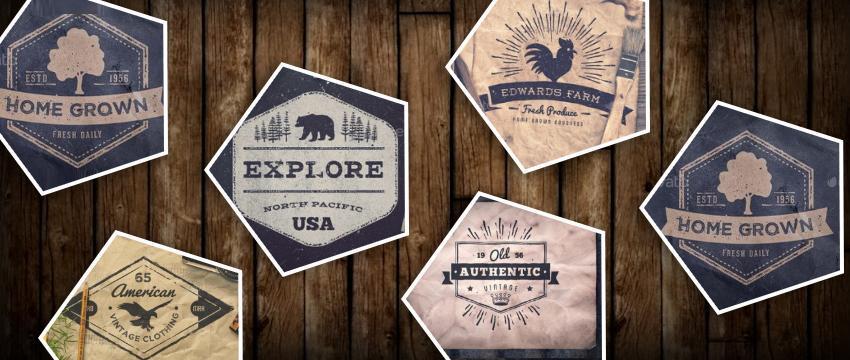
Many brands still prefer the simplicity and causality of hand-drawn logo designs. These logos are especially popular among restaurants, pubs and other food industry businesses where fun is an important part of the marketing strategy.
Their logos are designed with the purpose of reflecting the warmth, fun, and credibility promised by the brand. Hand-drawn logos were very popular in 2016 and became, even more, this year. See the example below.
#6. Cropping:
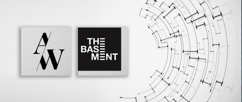
Many companies are experimenting with the concept of cropped designs that involve using only a part of the text actually needed to understand the name.
Take a look at the new cropped logo of Diet Coke that only features a part of the actual brand name yet clearly indicates what (or who) it refers to. Looks unique, doesn’t it?
#7. Simple Overlays:
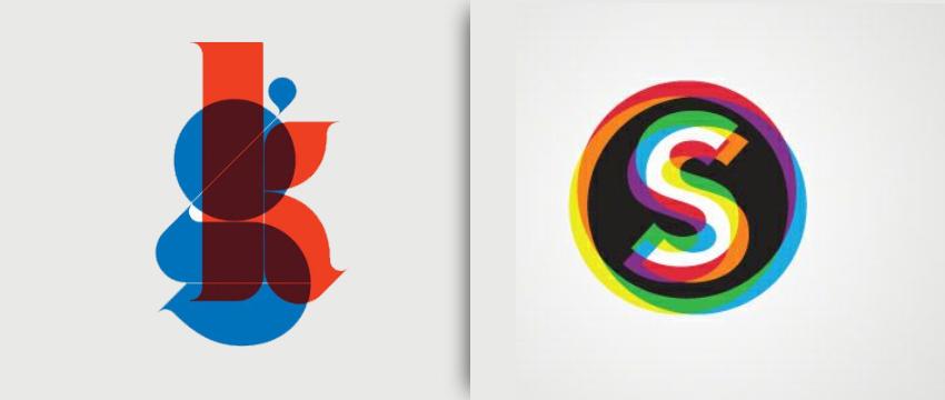
Some unique designs like MasterCard’s new logo and MetLife’s logo are the perfect example of simple yet complete logo designs.
These constitute two identical geometric figures partly overlapping each other. While the images represent the brand’s message, the text below simply contains the brand name.
The overlapping figures also point to the transparency attribute of the particular organization.
#8. Hidden Meaning:
Logo designs containing a hidden meaning or figure will always be popular, no matter what.
You must have all used FedEx service at one time or another. Ever looked at its logo carefully?
What we normally see is a text logo with the name FedEx Express in coloured letters. But the letters ‘E’ and ‘x’ are placed such that an arrow is formed in the space between them. It represents the express services of the company.
#9. Overlapping MultiCentric logos:
Since stripes have been especially popular in 2025, you can’t miss the logos with round stripes, particularly the ones with circles overlapping each other.
This type of logo can be used to show some kind of radiation in the brand and the impact of different things on each other, like waves rising when pebbles are dropped in the water. See the example logo image below.
#10. Geometric:
When Geometry meets the design, you get logos that are unique and clearly represent the brand motto in the simplest terms.
See below the logo of Street Kitchen which makes use of geometric shapes to indicate the brand name and what it means. The logo has been designed by Charlie Smith Design.
#11. Flexible Logos:
Simply put in companies’ words, when it comes to brand logo creation, a one-size-fits-all approach doesn’t work well across various platforms.
Businesses are looking to personalize company logos and use multiple variations of the same brand logo for a different set of audiences to maintain a unique relationship with each customer segment in 2025.
#12. Strong Typography:
With every passing year, designers have made bold choices when it comes to choosing fonts for logo design.
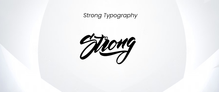
In 2025, designers are going all out with in-your-face fonts while creating logos for popular brands.
Multiple strong fonts are available for designers to choose from so they can create a striking logo, that reflects the brand persona very well.
#13. Icons:
One of the main trends that will likely be prevalent in the upcoming year is this one. Many companies favour keeping their brand logos simple and adaptable. Icons that are meaningful or abstract can assist in conveying the proper message with fewer components. They are consequently growing in popularity in logo design.
Icons are frequently chosen by IT, marketing, communication, and health and fitness businesses to symbolize their companies. It’s simpler to make an impression and provoke thought with a straightforward emblem.
#14. Glitch Effect:
TikTok’s logo has generated much interest for its unique effect and colour scheme. The glitch adds to the appeal of the design and makes the logo appear futuristic. In 2025, you might see businesses or brands creating a similar effect to grab the attention of younger consumers.
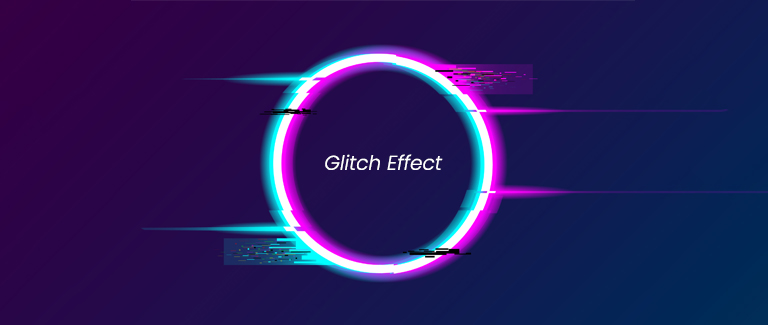
In 2025, you might see businesses or brands creating a similar effect. You can add the glitch effect to an icon, letter mark, pictorial or wordmark. With appealing colours, brands can draw attention to the design. People may also recognise the logo immediately and think of the brand positively.
#15. Gradients:
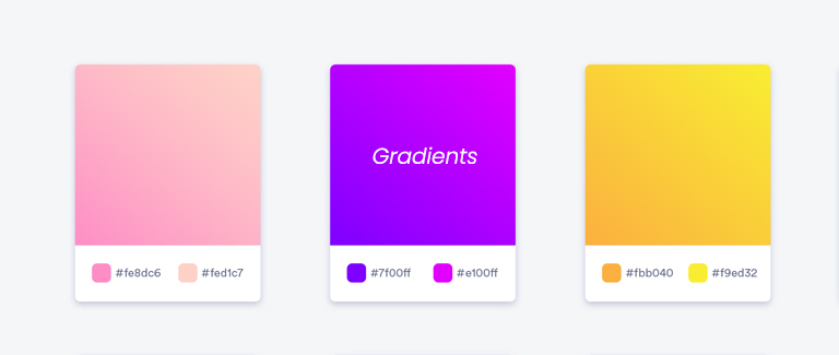
Gradients in logos have garnered a lot of attention for Instagram and Adobe Creative Cloud. In the upcoming year, it’s anticipated that the style will gain in popularity. Retail, software development, and cloud computing companies might use colours or gradients that represent what they have to offer.
#16. Muted Colors:
A logo can be created that is appealing and requires less maintenance as well over time by using natural and subtle colours like light brown, soft pink, pastel blue, or green. This is mostly due to the fact that these colours or shades can accurately depict the niche and also have a calming impact.
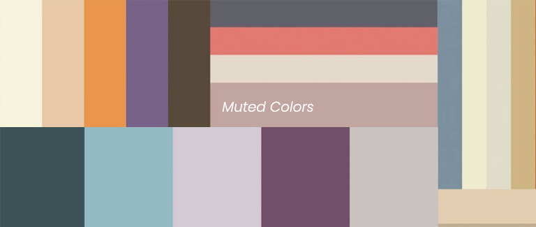
People in the industry believe that in 2025 enterprises involved in wellness, healthcare, retail, and travel will also utilize these colours. Because they don’t overwhelm the viewer, people may be convinced to look for more information and consider the items or services.
#17. Movement or Motion lines:
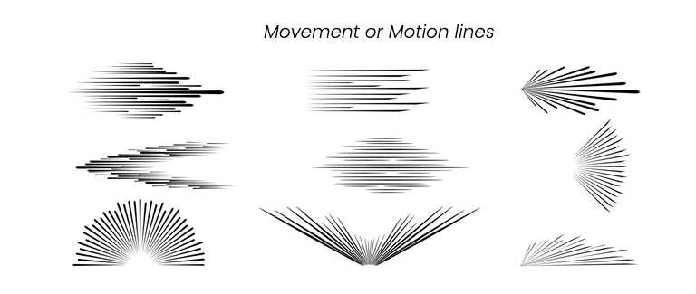
Movement or motion lines will become increasingly popular in brand logo design trends in the coming years. These dynamic icons may be used in applications, websites, or merchandise such as t-shirts and mugs. This approach is a fantastic way to engage a broader audience and highlight a company’s core values.
#18. Vanishing Effect on Objects & Text:
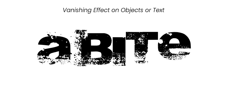
People may immediately notice and remember the logo thanks to the vanishing effect on a particular text or object in the logo. It can be added to lines, shapes, images, and even specific words in the corporate name. The appeal of logos in technology, computing, gaming, and entertainment also increases with the fading of text or objects. The number of this type of logo is expected to rapidly increase this year.
#19. Retro Touch:
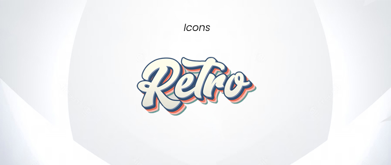
Many businesses like decorated logos that feature some retro element to make an impression on consumers and evoke sentiments of familiarity or comfort. These Retro logos on goods, at a shop, or on internet platforms might draw customers’ attention.
It’s also simpler to convey the brand story and foster a favourable impression in the audience’s minds. Since the antiquities industry is continuously growing and people value old things more, a logo with a retro touch will be in trend in the upcoming years.
These are the designs we liked the most in 2025. There might be more. So, do not hesitate to add more ideas in the comment section below, we are looking forward to it.
Conclusion:
That’s it for today in this article entitled “Logo Design Trends”, normally every brand is opting for a simple logo design that is capable of delivering their business idea.
However, there are some brands such as GoDaddy who opted for the letter-based simple logos, and people on the internet have mixed reactions to the new logo.
Thus make sure to choose an object, type, shape, and colour that fits well for your brand and business idea. Also, make sure that it engages the targeted audience. On this note, we would like to conclude this article.
